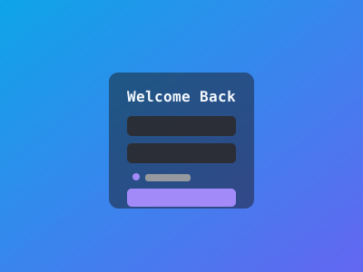
How to Make a Login Page Using CSS and HTML
Building a Login Page with HTML & CSS
A login page should be simple, fast, and accessible. Here’s how to build one that looks great and works well for everyone.
The HTML
Keep it minimal and semantic:
<!doctype html>
<html lang="en">
  <head>
    <meta charset="utf-8" />
    <meta name="viewport" content="width=device-width, initial-scale=1" />
    <title>Login</title>
    <link rel="stylesheet" href="styles.css" />
  </head>
  <body>
    <main class="login-page">
      <form class="login-form" novalidate>
        <h1>Welcome back</h1>

        <div class="field">
          <label for="email">Email</label>
          <input type="email" id="email" name="email" autocomplete="email" required />
        </div>

        <div class="field">
          <label for="password">Password</label>
          <div class="password-wrap">
            <input type="password" id="password" name="password" autocomplete="current-password" required />
            <button type="button" class="toggle-password" aria-label="Show password">Show</button>
          </div>
        </div>

        <div class="options">
          <label class="checkbox">
            <input type="checkbox" name="remember" />
            <span>Remember me</span>
          </label>
          <a href="/forgot" class="forgot">Forgot password?</a>
        </div>

        <button type="submit" class="submit-btn">Sign in</button>

        <p class="signup-link">
          Don't have an account? <a href="/register">Register</a>
        </p>
      </form>
    </main>
  </body>
</html>
The CSS
:root {
  --bg: #0f0f10;
  --card: #161618;
  --text: #e8e8e8;
  --muted: #9a9a9a;
  --border: #2a2a2e;
  --accent: #a78bfa;
  --radius: 0.6rem;
}

* {
  box-sizing: border-box;
  margin: 0;
}

body {
  font-family: system-ui, sans-serif;
  background: var(--bg);
  color: var(--text);
  line-height: 1.6;
}

.login-page {
  min-height: 100vh;
  display: grid;
  place-items: center;
  padding: 2rem 1rem;
}

.login-form {
  width: 100%;
  max-width: 22rem;
  background: var(--card);
  border: 1px solid var(--border);
  border-radius: var(--radius);
  padding: 2rem;
}

.login-form h1 {
  font-size: clamp(1.3rem, 2vw + 0.9rem, 1.6rem);
  text-align: center;
  margin-bottom: 1.5rem;
}

.field {
  margin-bottom: 1rem;
}

label {
  display: block;
  font-size: 0.85rem;
  color: var(--muted);
  margin-bottom: 0.3rem;
}

input {
  width: 100%;
  padding: 0.7rem 0.9rem;
  background: var(--bg);
  border: 1px solid var(--border);
  border-radius: var(--radius);
  color: var(--text);
  font-size: 1rem;
}

input:focus {
  outline: 2px solid var(--accent);
  outline-offset: 1px;
}

.password-wrap {
  position: relative;
}

.toggle-password {
  position: absolute;
  right: 0.6rem;
  top: 50%;
  transform: translateY(-50%);
  background: none;
  border: none;
  color: var(--muted);
  font-size: 0.8rem;
  cursor: pointer;
}

.options {
  display: flex;
  justify-content: space-between;
  align-items: center;
  margin-bottom: 1.25rem;
  font-size: 0.85rem;
}

.checkbox {
  display: flex;
  align-items: center;
  gap: 0.4rem;
  color: var(--muted);
  cursor: pointer;
}

.checkbox input {
  width: auto;
}

.forgot {
  color: var(--accent);
  text-decoration: none;
}

.submit-btn {
  width: 100%;
  padding: 0.8rem;
  background: var(--accent);
  color: #fff;
  border: none;
  border-radius: var(--radius);
  font-size: 1rem;
  font-weight: 600;
  cursor: pointer;
}

.submit-btn:hover {
  opacity: 0.9;
}

.signup-link {
  text-align: center;
  margin-top: 1.25rem;
  font-size: 0.9rem;
  color: var(--muted);
}

.signup-link a {
  color: var(--accent);
}
The show/hide password script
A tiny bit of JS makes the password toggle work:
const toggle = document.querySelector('.toggle-password');
const input = document.getElementById('password');

toggle.addEventListener('click', () => {
  const isPassword = input.type === 'password';
  input.type = isPassword ? 'text' : 'password';
  toggle.textContent = isPassword ? 'Hide' : 'Show';
  toggle.setAttribute('aria-label', isPassword ? 'Hide password' : 'Show password');
});
What makes this good
autocomplete="current-password"— tells password managers to fill in the saved password, not offer to create a new one.- Show/hide toggle — positioned with
position: absoluteinside a relative wrapper, usingtransform: translateY(-50%)for vertical centering. - Remember me + Forgot password row uses
display: flexwithjustify-content: space-between— they sit on opposite edges naturally. max-width: 22rem— login forms are narrower than register forms. Usingremkeeps the width tied to font size, not viewport.
Pair this with the register page and you’ve got a complete auth flow.