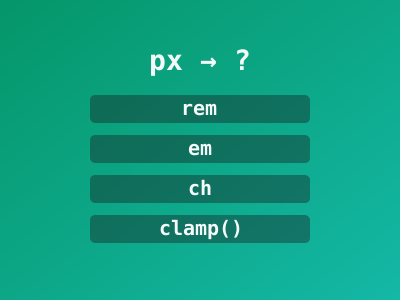
Stop Using CSS Pixels for Everything. Try These Instead!
Stop Using CSS Pixels for Everything. Try These Instead!
If every value in your CSS ends in px, you’re making your site harder to
maintain and less accessible. Pixels are absolute — they don’t scale with
user preferences. Let’s fix that.
The core idea: use relative units that adapt to context and user
settings. Save px for thin borders and tiny decorative details.
The problem with px
When a user increases their browser’s default font size (in settings), px
values don’t respond. A 16px heading stays 16px even if the user set
their base size to 20px. That’s an accessibility failure.
/* Bad: ignores user preferences */
body { font-size: 16px; }
h1 { font-size: 32px; }
.card { padding: 20px; }
1. rem — for typography and spacing
rem (root em) is relative to the root font size (usually 16px by default).
If the user changes their browser font size, everything in rem scales
with it.
/* Good: respects user preferences */
body { font-size: 1rem; }     /* 16px at default */
h1 { font-size: 2rem; }       /* 32px at default, scales up */
.card { padding: 1.25rem; }   /* 20px at default */
A handy trick: set a fluid root
html {
  font-size: clamp(1rem, 0.5vw + 0.9rem, 1.125rem);
}
Now your entire site’s typography scales smoothly from mobile to desktop — and
every rem value follows.
2. em — for component-relative sizing
em is relative to the parent’s font size. This makes it perfect for
components that should scale with their context:
.card {
  font-size: 1.125rem; /* slightly larger base */
  padding: 1em;        /* scales with the card's font size */
  gap: 0.75em;         /* spacing proportional to text */
}

.card .badge {
  font-size: 0.75em;   /* always 75% of the card's text */
  padding: 0.3em 0.6em;
}
If you later change .card’s font-size, everything inside scales
proportionally. No recalculating every padding value.
3. ch — for reading width
ch equals the width of the 0 character in the current font. It’s ideal for
constraining line length for readability:
.article {
  max-width: 65ch;  /* ~65 characters per line — optimal reading width */
}
This is better than a fixed rem width because it adapts to the font being
used.
4. % — for flexible layouts
.sidebar { width: 30%; }
.main { width: 70%; }
img { max-width: 100%; }
Percentages make elements fill their container proportionally — the foundation of responsive design.
5. vw / vh — viewport-relative units
vw= 1% of viewport widthvh= 1% of viewport height
.hero {
  min-height: 100vh;        /* full viewport height */
  padding: 5vh 5vw;         /* proportional to viewport */
}

.hero h1 {
  font-size: clamp(2rem, 5vw, 4rem);  /* scales with viewport */
}
The dvh trick for mobile
On mobile, 100vh includes the area behind the browser’s address bar — which
can cause overflow. Use dvh (dynamic viewport height) instead:
.hero {
  min-height: 100dvh;  /* adapts when the address bar shows/hides */
}
6. min() / max() / clamp() — intelligent bounds
These functions let you combine units intelligently:
/* Never smaller than 280px, never larger than 90% of parent, prefer 50% of parent */
.sidebar {
  width: min(90%, 320px);
}

/* Padding: at least 1rem, scales with viewport, max 3rem */
.section {
  padding: clamp(1rem, 4vw, 3rem);
}
Quick reference: which unit when?
| Unit | Use it for | Why |
|---|---|---|
rem | Font sizes, page spacing | Scales with user settings |
em | Component-internal spacing | Scales with component context |
ch | Max line length | Optimal reading width |
% | Layout widths | Fills container proportionally |
vw / vh | Hero sections, full-height | Relative to viewport |
dvh | Mobile full-height | Handles mobile address bar |
clamp() | Fluid values | Min/preferred/max in one |
px | Borders, shadows, hairlines | Needs to be pixel-exact |
Don’t mix systems. If your root uses rem but your components use px
for padding, you lose the scaling benefit. Pick a system and be consistent.
The takeaway
Switching from px to relative units is the single easiest CSS improvement you
can make for accessibility and maintainability. Start with typography
(rem), then spacing (em inside components), then layout (% and ch).
Your users — especially those who zoom or change font size — will thank you.